Dashboard
Customize your in-app Dashboard — cards, presets, time periods, and multi-vehicle stats
What is the Dashboard?
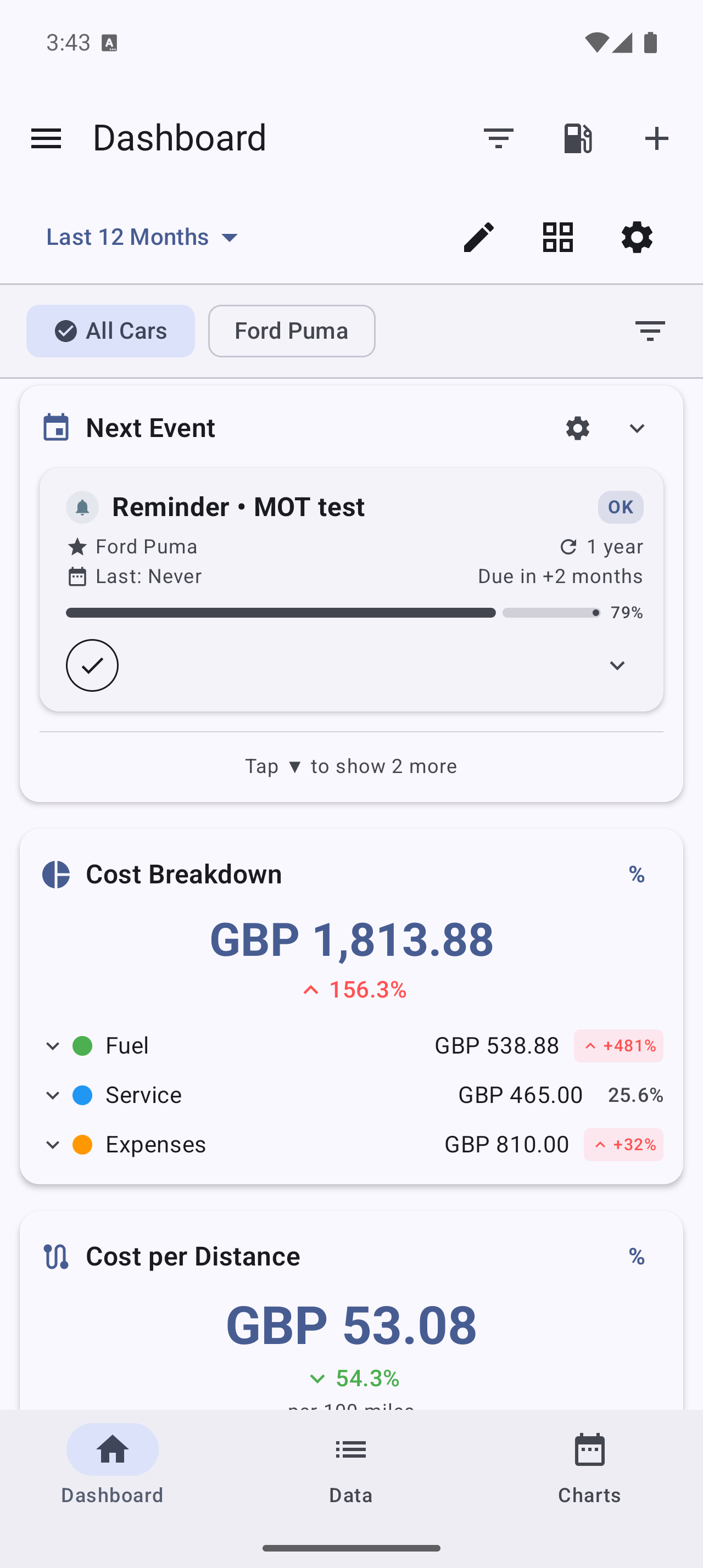
The Dashboard is the home screen inside My Cars. It summarizes your vehicle’s data into a stack of cards (also called dashboard widgets) — fuel efficiency, costs, your next service, recent activity, and more. You choose which cards appear, in what order, and over what time period.
Not to be confused with home screen widgets, which sit on your Android home screen outside the app. See Home Screen Widgets.
How do I customize the Dashboard?
- Open the Dashboard (the app’s home screen)
- Tap Customize Dashboard (or the edit/pencil action in the top bar)
- Use Manage Widgets to turn cards on or off
- In edit mode, drag cards to reorder them
- Exit edit mode to save your layout
You can show only the cards you care about and hide the rest.
Are there ready-made layouts?
Yes. Instead of building a layout card by card, pick a preset:
| Preset | Best for |
|---|---|
| Minimal | Just the essentials (e.g. efficiency and your next service) |
| Standard | A balanced overview — the default for new users |
| Detailed | A comprehensive view for power users |
| Classic | The familiar table-style layout from MyCars 2.0 |
Pick a preset as a starting point, then customize from there.
What cards can I add?
Cards are grouped by theme. Available cards include, for example:
- Costs — cost breakdown, monthly cost, cost per distance, cost summary
- Efficiency — an efficiency gauge, efficiency trend, best/worst trip
- Fuel — recent fuel price
- Vehicle — odometer, your next service
- Summary — monthly summary, recent activity, key metrics, record counters, CO₂ savings
Some cards require a subscription:
- PRO unlocks budget-oriented cards such as Budget Progress, period comparison, fuel consumption and yearly trends.
- PRO+ unlocks advanced cards such as Insights & Alerts, Vehicle Health, and station-savings cards.
The exact set of cards continues to grow with app updates.
What is the CO₂ Savings card (trees saved)?
If you drive an electric or plug-in hybrid, add the CO₂ Savings card (in the Summary group — it’s free) to see how much CO₂ you’ve avoided compared with an equivalent petrol car. It shows the kilograms saved, the distance driven on electric power, your savings expressed as ”≈ N trees worth of annual CO₂ absorption,” and an all-time lifetime total.
It uses your real charging efficiency and your region’s grid carbon intensity, both adjustable in CO₂ Calculation Settings. The card only appears for electric and plug-in hybrid vehicles. See Electric, Hybrid & Alternative Fuels for the full details.
How do I change the time period?
The Dashboard has a period selector at the top. Choose from:
- This Week, This Month, This Year
- Previous Week, Previous Month, Previous Year
- Last 30 Days, Last 6 Months, Last 12 Months
- All Time
- Custom… (pick your own date range)
Every card updates to the period you select.
Can I compare to the previous period?
Yes. Turn on Period Comparison to show the current period next to the previous one (for example, this month vs. last month), so you can see whether your costs or efficiency are trending up or down.
Does the Dashboard work with multiple vehicles?
Yes. A vehicle filter at the top lets you:
- View a single vehicle (its individual stats)
- Select several vehicles at once (aggregated stats)
- View all vehicles (your whole fleet)
Use Active vehicles only to exclude vehicles you’ve marked as sold, so they don’t skew your totals.
My Dashboard looks empty — why?
The Dashboard fills in as you add data. Log a refuel or two, a service, and a bill, and the cards begin to populate. If a card shows “no data”, it usually means there are no records for the selected vehicle in the selected time period — widen the period or check your vehicle filter.