Charts & Statistics
Understanding fuel trends, cost analysis, and efficiency graphs
What charts are available?
My Cars offers several chart types:
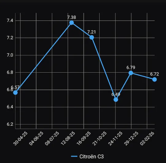 The fuel efficiency over time chart
Fuel & Efficiency:
- Fuel efficiency over time - Track your consumption trends
- Fuel price over time - Monitor fuel price changes
- Monthly fuel efficiency - Efficiency aggregated by month
- Estimated autonomy - Driving range on a full tank
Costs:
- Cost pie chart - Breakdown of all costs (fuel, services, bills)
- Running costs pie chart - Service, refuels, and bills only
- Monthly running costs - Costs aggregated by month
- Running costs over time - Cost trends
Vehicle:
- Car odometer over time - Mileage progression
- Vehicle devaluation - Estimated value over time
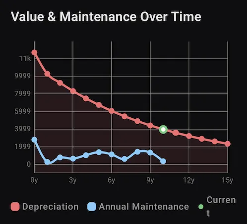 Vehicle value and annual maintenance over time
How do I access charts?
- Open the navigation menu
- Tap Charts
- Select the chart you want to view
- Use swipe gestures to explore data points
How do I customize chart display?
While viewing a chart:
- Avg - Toggle average line display
- Scale - Adjust Y-axis scaling
- Highlight - Emphasize specific data points
- Left/Right axis - Configure dual-axis display
How do I export a chart?
- Open the chart you want to export
- Tap the Export chart button (share icon)
- Choose your export format or destination
- The chart is saved as an image
Why are some efficiency values missing?
Fuel efficiency requires:
- At least two refuels to calculate
- Full tank refuels (not partial)
- Correct odometer readings
Partial refuels can be excluded from charts via Settings > Discard partial refuels in charts.
How do I view cost breakdowns?
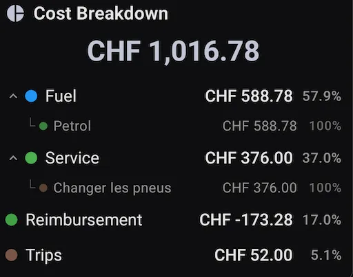 The cost breakdown — fuel, service, reimbursements and trips by share
To see where your money goes:
- Go to Menu > Charts
- Select Cost pie chart for full breakdown including:
- Fuel costs
- Service costs
- Bills and expenses
- Vehicle purchase cost
Or select Running costs for just operational expenses.